Serif or Sans Serif on a Long Page?
Serif or sans serif on a long page? Compare type, size and spacing to choose a clear, coherent reading experience for your guide, report or website.
Serif or sans serif on a long page? The answer depends on the typeface, layout and reading context, not just the category. A serif face may feel bookish or formal; a sans serif may feel direct or contemporary. Neither quality makes a page easier to read by itself.
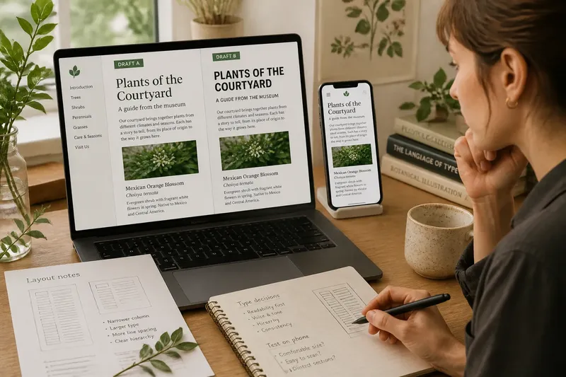
Imagine a small museum preparing an online guide to plants in its courtyard. Visitors will read descriptions at home and on phones. The editor begins with a familiar pairing—serif prose and sans serif headings—but treats it as a possibility to assess, not a rule. Text size, line length and spacing must work with the type, too.
Two typographic voices
The museum’s first draft uses a serif face for the main text and a sans serif for headings, captions and navigation. The serif gives the descriptions a measured, literary character. The sans serif signals structure and makes the page easier to scan.
In a second draft, the team reverses the arrangement: sans serif prose and serif headings. This feels more contemporary, but the headings draw attention away from the descriptions. The issue is hierarchy, not an inherent flaw in either font category. Headings should guide readers into the material, not overwhelm it.
A serif typeface has small finishing strokes at the ends of some letterforms; a sans serif lacks them. Fonts within either group vary in shape, width, weight and spacing. An open sans serif may feel gentler than a tightly set serif, while a serif can be restrained or decorative.
Serif or sans serif settings?
Does serif type help with long reading?
It may suit reflective, literary or institutional content, but finishing strokes alone do not determine comfort. Compare the actual typefaces at the size and line length planned for the page.
Is sans serif clearer on a screen?
It can look crisp in interface labels and compact headings. In long prose, clarity still depends on distinct letterforms, suitable size, spacing and the screen on which the page appears.
Should headings and body text use different styles?
They can, if the contrast helps readers recognise the page structure. Different weights in one family may feel unified; two contrasting families need a clear purpose and must remain easy to distinguish.
Which font works best on a phone?
There is no universal winner: screens, typefaces and reader preferences differ. Check the page at its intended phone size and confirm that the text is comfortable to follow without pinching or excessive scrolling.
Size changes the voice
The museum’s first draft uses small body text. Narrow letters and compressed spacing make the page look neat on a large monitor, but the lines feel dense on a phone. The team increases the text size and opens the spacing. The prose becomes easier to approach, while the page grows longer and headings need proportionate styling to stay connected to their paragraphs.
Size affects character as well as legibility. A delicate serif can seem elegant when large, then lose distinction when reduced. A heavy sans serif may feel confident in a heading but blunt in a long passage. Judge the typeface where readers will encounter it, rather than relying on an alphabet sample.
Line and paragraph spacing
Line spacing is the vertical distance between lines. Too little can make neighbouring lines blur together; too much can loosen a paragraph until its sentences feel disconnected. Line length matters as well. Long lines make it harder to return to the start of the next one, while very short lines interrupt a thought with frequent breaks.
Spacing is like the gaps between chairs at a table: enough room lets each place feel distinct, but too much distance makes conversation harder. For the museum page, the team adjusts line length and spacing alongside font size. Clear paragraph breaks also help readers find their place after pausing.
Content shapes the choice
The guide contains more than continuous prose. It includes plant names, captions, links and a contents list, each with a different job. A sans serif may make short labels quick to scan, while a separate body face carries the descriptions. Keep the number of styles limited, and make each typographic change signal something useful.
Tone matters, too. A formal report, a friendly explainer and a children’s activity sheet call for different voices. Type contributes to that voice, but so do wording, colour, imagery and layout. A severe display face may make a botanical guide feel less welcoming, even if the body text is comfortable.
A worked page revision
Say the editor has an open, moderate-weight serif for the descriptions and a restrained sans serif for headings and labels. The editor raises the body size, adjusts line spacing and narrows the text column. On a phone, the expected result is a clear column without very long lines; on a wide screen, the prose stays contained instead of stretching across the display.
This invented situation does not establish a rule for every long page. It shows how the initial font choice becomes more convincing when scale, spacing and mixed content receive attention. If the revised combination feels stiff or crowded, the editor can compare another face or alter the layout rather than blaming the category alone.
Compare the finished page
When choosing serif or sans serif on a long page, compare complete passages, not single words or alphabet samples. Keep the text, heading structure and screen size consistent between drafts. Check whether similar letters are distinct, lines are easy to follow, section changes are recognisable and the page feels comfortable to read.
Change one feature at a time. If you alter the font, size, line length and colour together, it becomes difficult to tell which choice affected the experience. Review the whole page, and, if possible, ask someone unfamiliar with the draft to read a section. Their pauses or questions can point to places that need attention without turning one person’s preference into a universal verdict.
For the museum guide, the answer is not simply “serif wins”. It is a considered pairing shaped by the page’s purpose and checked at the sizes where people will read it. Let the content and context lead, then refine the letterforms, spacing and scale until the page feels coherent as well as legible.