Before the Grid: Pages Arranged by Hand
Hand-set page composition shows how printers balanced craft and consistency, and why a grid became a useful guide rather than a substitute for judgement.
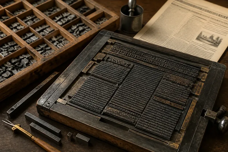
How did printers make pages feel orderly before a grid told them where everything belonged? Hand-set page composition relied on the eye, the material on the workbench and repeated decisions made by skilled people. Its history is not a simple passage from disorder to precision: it is a change in how craft and consistency were produced.
Order before templates
A page is a bounded space that must hold words, images, margins and pauses. Before designers could apply a reusable digital template, compositors arranged physical type and other printing materials into a form that could be inked and pressed onto paper. The layout had to be built, not merely viewed on a screen.
In letterpress printing, each metal character was a separate piece. A compositor selected sorts from a type case and assembled them into lines, with spaces used to make a line fit its measure. Lines were gathered into blocks of text. Rules, ornaments and blank pieces of metal could create divisions, gaps or frames. The page emerged through handling and adjustment.
That work imposed practical limits. Type had a fixed size and shape, a line could not be stretched without changing its spacing, and a page form needed to hold together during printing. A layout was therefore both a visual arrangement and a physical construction. A change to one line could affect the fit of a paragraph or the balance of a column.
The compositor’s eye
Without a printed grid governing every position, the compositor judged alignment through relationships. Headlines might begin at the same edge as the text below. A rule could separate a notice from an article. White space could give a heading room to register as a distinct element.
These choices were not arbitrary. Printers inherited conventions for setting books, newspapers, forms and advertisements, and readers learned to recognise their patterns. A book page often favoured a steady block of text; a notice might place its title centrally and group details beneath it. The page’s purpose, available type and printing method all shaped the arrangement.
Consistency came from skilled repetition. A compositor who understood a publication’s established appearance could set another page with similar margins, measure and hierarchy. That continuity depended on people remembering and applying decisions, rather than on a hidden structure automatically positioning each element.
Making repeatability
As printing businesses produced recurring publications, consistency became a practical concern. A newspaper needed recognisable columns and recurring headings, while a book needed pages that belonged to the same volume. Printers could reuse type arrangements, keep notes about settings and establish house conventions. These methods made recurring layouts easier to reproduce, though they still called for judgement when content changed.
Mechanical composition later altered the scale and speed of setting type. Machines could assemble lines or type in a more repeatable way than selecting every character by hand. Yet repeatable typesetting did not, by itself, decide where a headline should sit or how much room a photograph should occupy. The distinction matters: production could become more regular while page composition remained a matter of design.
Imagine a small print shop preparing a weekly market sheet. The compositor sets its column headings from the same measure each time and keeps the title aligned with the first column. One week, a long notice threatens to crowd the bottom of the page. The compositor shortens the notice with the editor’s approval or adjusts the surrounding spacing, preserving the familiar structure while giving the changed content the room it needs.
The example shows consistency as a maintained relationship, not a mechanical copy. A repeatable arrangement gives readers cues, while a person decides how to handle material that does not fit the established pattern.
What a grid changes
A grid is a set of underlying alignments and divisions that helps organise content. It can define columns, margins, baselines or recurring positions. Unlike a single visible rule, a grid may be an invisible guide: elements can align to it without lines appearing on the finished page.
Using a grid shifts some decisions from individual placement to a shared structure. A designer can align a caption with a column edge, place images within consistent zones and carry those relationships across a sequence of pages. In a team, the structure also gives different people a common reference, so consistency does not depend entirely on one compositor’s memory.
That does not remove craft. Someone still chooses the number and width of columns, the distance between them and which elements should align. A grid can make a page regular, but regularity alone does not make it readable or expressive. The design still needs to respond to the content and the habits of its readers.
A useful analogy is a tray with compartments. The compartments help keep objects in order, but they do not decide which objects belong together or whether one item needs more room. A page grid similarly offers places and relationships; the designer chooses how to use them.
When the structure bends
Hand composition and grid-based design are not opposites. Printers working by hand could follow strict alignments, while a designer using a grid could choose to cross its boundaries. The difference lies in how the arrangement is organised and repeated, not in whether a page looks tidy or expressive.
A grid is most useful when it supports a real pattern: recurring columns, a series of related pages or a mix of text and images that needs stable alignment. If a page contains a single short announcement, an elaborate grid may add decisions without solving a problem. Conversely, a hand-arranged page can become difficult to reproduce if its logic exists only in one person’s memory.
Designers often create hierarchy by varying scale, position, weight and spacing. A title can dominate through size, but it can also gain emphasis through isolation or alignment. Hand-set work made these relationships tangible because changing one element meant moving actual material. The grid makes relationships easier to repeat, but it does not decide which relationship deserves attention.
Reading the page today
Looking closely at an older printed page can reveal evidence of its construction. Notice whether column edges recur, how headings relate to the text block, and whether rules or ornaments divide information. Uneven spacing may reflect the constraints of setting and fitting type, but it can also be a deliberate choice. A page’s appearance alone does not tell the whole production story.
For contemporary work, the useful question is not whether to imitate hand setting or impose a rigid grid. It is which decisions should stay flexible and which should repeat. A publication with recurring pages may benefit from shared alignments, while a one-off poster may need a more singular composition. In either case, the designer can make the underlying logic visible through consistent relationships.
Before the grid, page order was already being designed through material choices, conventions and trained judgement. The grid made certain relationships easier to carry from page to page and from person to person. Seeing that distinction helps explain why a grid is best treated as a tool for sharing decisions, not as a replacement for making them.
Questions about hand composition?
What did a compositor do?
A compositor selected and arranged type and spacing material into lines and page forms for printing. The task combined reading the copy with managing the physical fit and visual order of the page.
How were pages aligned without a grid?
Compositors relied on shared measures, repeated conventions and visual judgement. Margins, column edges, rules and headings could establish alignments even when no underlying grid was formally specified.
Did grids replace hand-set type?
No. Grids are a way to organise page relationships, while hand-set type is a method of producing text for print. A designer can use a grid with many production methods, and a hand-set page can follow a precise structure.
Why use a grid for a printed publication?
A grid can help recurring pages share alignments and make it easier for a team to place text and images consistently. It remains useful only when its structure suits the content and the publication’s purpose.